
By Jamie Cumby, Librarian
The Grolier Club Library has rotating exhibits of books from our collections in four small cases in the reading room. The following text and examples come from the current exhibit, “Printing Non-Latin Characters in the Grolier Club’s Collection” installed on June 15th, 2024. The Library is always open to Grolier Club members during our regular hours, and researchers may visit with an appointment by emailing our Librarian.
The Grolier Club Library is, predominantly, a Western collection, focused on the book’s history, craft, and trade in Europe and the Americas. This exhibition explores a category of books at the boundaries, both literal and metaphorical, of our collection: books printed outside of the Latin alphabet. The examples collected in these four small cases look at attempts by European organizations, printers, scholars, and type designers to print texts in classical and living languages, and by East Asian printers to communicate with global audiences. The examples brought together here span five centuries, 14 alphabets, and four printing techniques, but, in keeping with the scope of the Club’s collection, only one case features texts printed outside of Europe.
This exhibition invites you to think about these books not by language groups or printing methods, but by the uses to which they, and the characters within them, were put. It begins with official print, produced by ecclesiastical and political organizations and moves into scholarly projects, some state-sponsored, to recreate classical languages in type. The three examples that step outside of Europe echo some of these themes while introducing a new category: printing for a multilingual diaspora community. Finally, it turns to written rather than spoken alphabets, developed for accessibility, speed, and communication in multiple languages.
Church and State
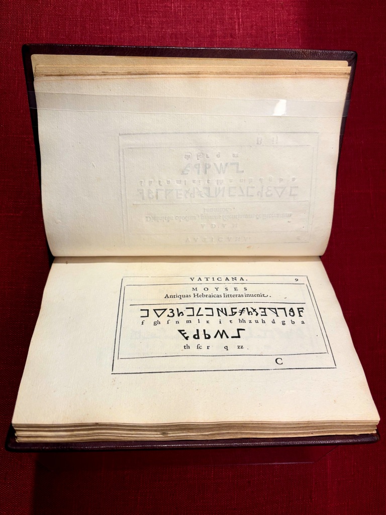
The types within this specimen represent the full arsenal of the Vatican’s scholarly and administrative presses, including non-Latin types suitable for liturgy, editions of the church fathers, and proselytizing. Many are woodcuts rather than type metal, six of which were-reused from Anelo Rocca’s 1591 description of the Vatican Library, where they featured as reproductions of the alphabet frescoes in the Salone Sistino. The repurposed blocks were sawn in half to make space for typeset Latin transliterations. The early Hebrew alphabet pictured here is from one of these blocks and appears twice in the specimen. To create the illusion of a new set of characters, the upper half of the block was inverted to make the first line appear different from the impression on the preceding leaf.
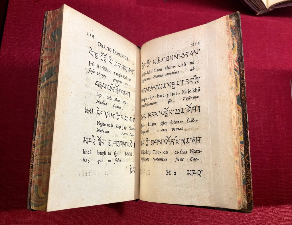
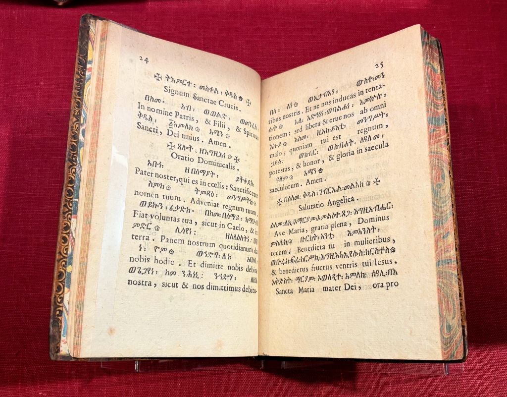
As the missionary arm of the Catholic Church, the Sacra Congregatio de Propaganda Fide maintained one of the largest assemblies of non-Latin type in Europe. Its polyglot press was responsible for scholarly editions, religious texts in translation, and textbooks, like the Alphabetae in this case. Each Alphabet included basic grammar and a series of standard religious texts in translation, which you can see by comparing the Ge’ez and Tibetan Lord’s Prayer in these two examples. The Club’s set of these editions includes 14 editions covering 12 languages, printed between 1771 and 1797 and bound in two volumes by a contemporary collector. The two specimens shown here represent two of the three major types of languages studied at the Propaganda: liturgical languages of other Christian churches and languages spoken by communities with active missions.
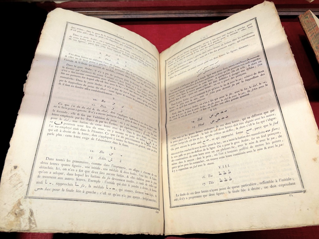
Even before it absorbed the types and matricies of the Propaganda Fide, the Imprimerie Royale had its own sophisticated set of non-Latin types. In addition to Francis I’s commissions, like the grecs du roi in the following case, Cardinal Richelieu acquired types for printing a number of living languages for missionary and diplomatic purposes. The manual for compositors in this case stems from an eighteenth-century revival of these types, focusing especially on the press’ calligraphic Arabic types first created by François Savaray de Brèves. It explains how compositors and typefounders should use the punches for 18 base characters, along with punches for a series of diacritical marks, to create an expansive series of letterforms that could replicate the subtleties of the Arabic, Turkish, and Persian manuscripts held in the royal library.
Scholarship
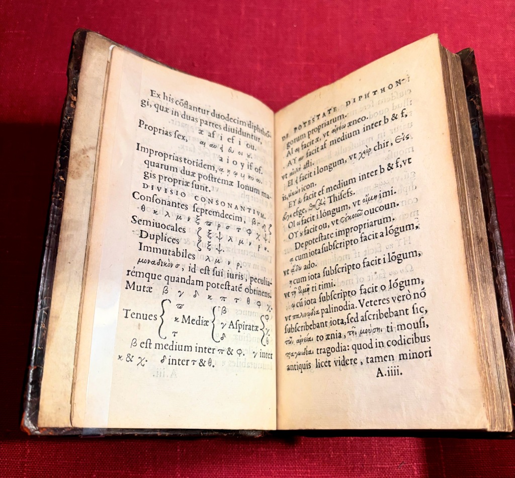
The types in use for this beginner’s study text are the grecs du roi, the exquisite set of cursive Greek types created for Robert Estienne’s use as the official printer in Greek to King Francis I. The grammar acts as a convenient specimen of these types, detailing each character and ligature. This edition, bound with two other Paris-printed introductory texts for learning Greek, was the final and most extensive edition of the Greek Alphabetum that Estienne printed in Paris. In the same year, his then-controversial humanistic biblical translations would force Estienne to flee Paris for Geneva.
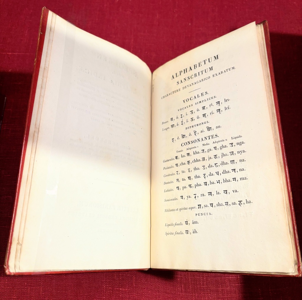
August Wilhelm von Schlegel and his more famous older brother Friedrich wanted to spark a scholarly craze for Indic studies, akin to the popularity of Greek studies in the fifteenth and sixteenth centuries. Though Friedrich turned away from Sanskrit grammar to focus on philosophy, August Wilhelm devoted much of his career to this dream. Comissioning a new set of Devangari types was essential to his project, which included the establishment of a press in his home in Jena to produce critical editions of Sanskrit texts and his journal, Indische bibliothek. This specimen represents the first use of the new typeface, based on a manuscript copy of the Ramayana created in 1760 and held at the Bibliothèque Royale de France.
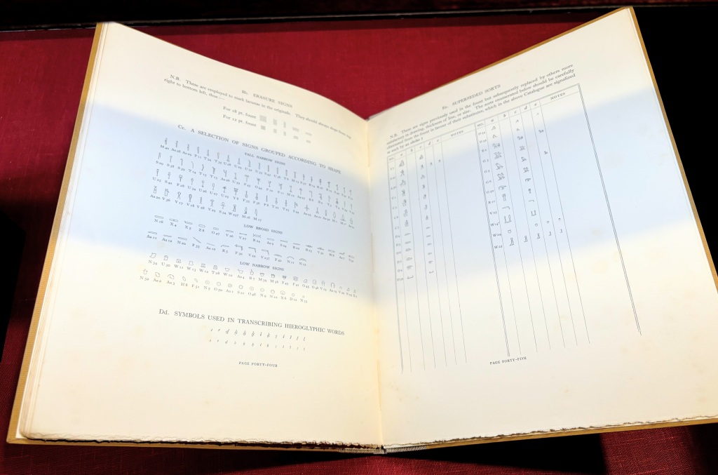
Printers have made attempts to reproduce hieroglyphic characters as early as the Hypnerotomachia Poliphili, but no metal hieroglyphic typeface saw widespread adoption or success until the publication of this type specimen. In developing his own set of types, Egyptologist Alan Gardiner’s mission was both scholarly and practical. He needed a typeface for his 1927 Egyptian Grammar that would not only represent the most accurate understanding of Ancient Egyptian palaeography, but that could be set alongside the standard, 12-point roman typeface of his English text. Gardiner financed the project out of his own pocket, employing skilled artists Norman and Nina de Garis Davies to design the types and collaborating with Oxford University Press to produce the matrices. A complete set of the types with sufficient sorts to print with spanned 50 cases of type, laid out in vertical rows by character. A number of institutions bought fonts of Gardiner’s types, which became the leading method for printing Egyptian texts until the advent of digital typesetting.
Printing for International Markets
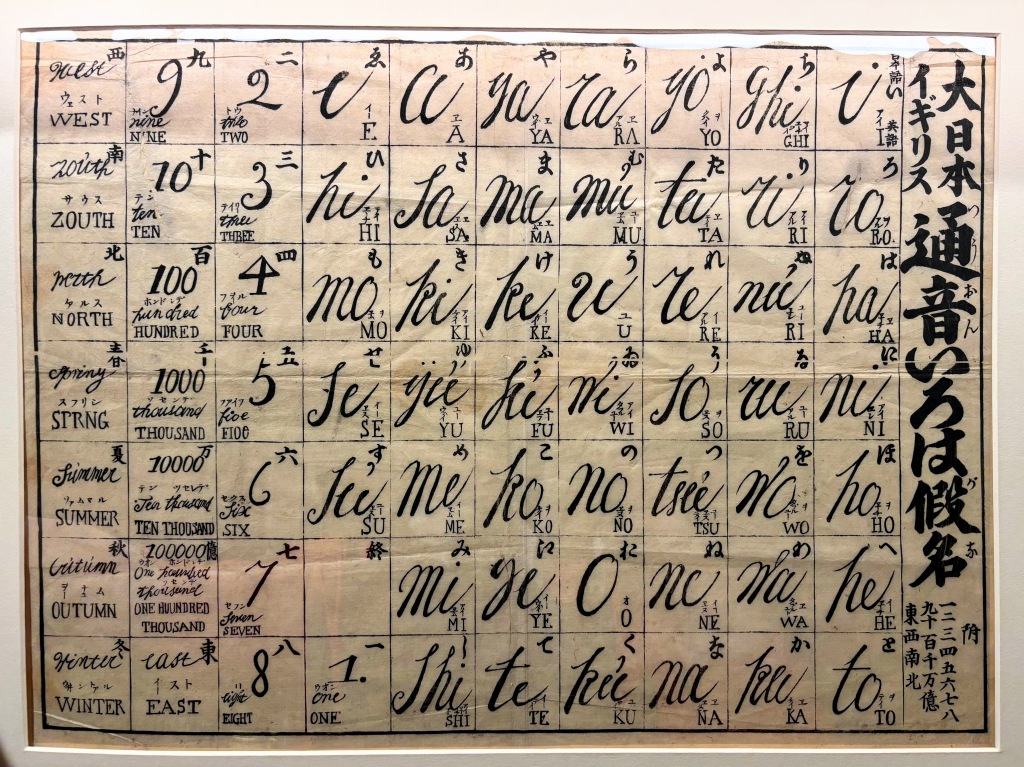
This broadsheet woodblock print is a teaching tool, pronunciation guide, and poem, designed to help English-speakers learn Japanese speakers. The text uses each character of the syllabary exactly once, functioning like a hiragana version of an Abecedary. Each character of the poem, and the list of numbers, cardinal directions, and seasons that follows it, includes a phonetic pronunciation guide and Latin alphabet equivalent, designed to familiarize English speakers with the sounds and symbols of Japanese.
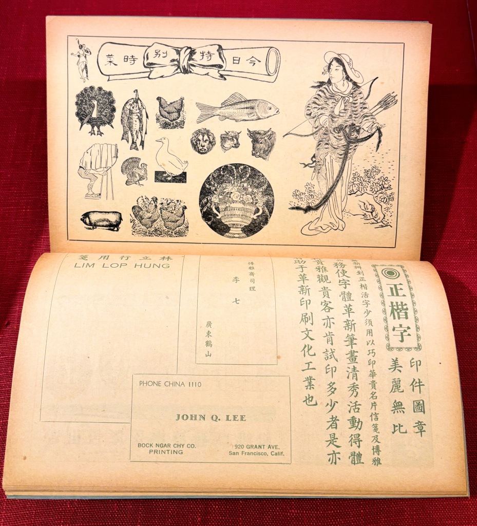
San Francisco’s Chinatown, the first major Chinese community established in the United States, was home to a number of small printing firms that catered to the diaspora community. This specimen is from the largest of these printing workshops, the Bock Ngar Chy Company. Chinatown native Lee Shew Hung founded the shop in 1906 following the great earthquake that destroyed much of the city, including the original Chinatown neighborhood where he was born. His company was a stationary shop and printing press catering to the Chinese-American community in California and beyond, to customers in mainland China, and to English-speakers learning Chinese. This specimen represents the company’s eclectic jobbing business, with types and ornaments suitable for books, advertisements, and calling cards.
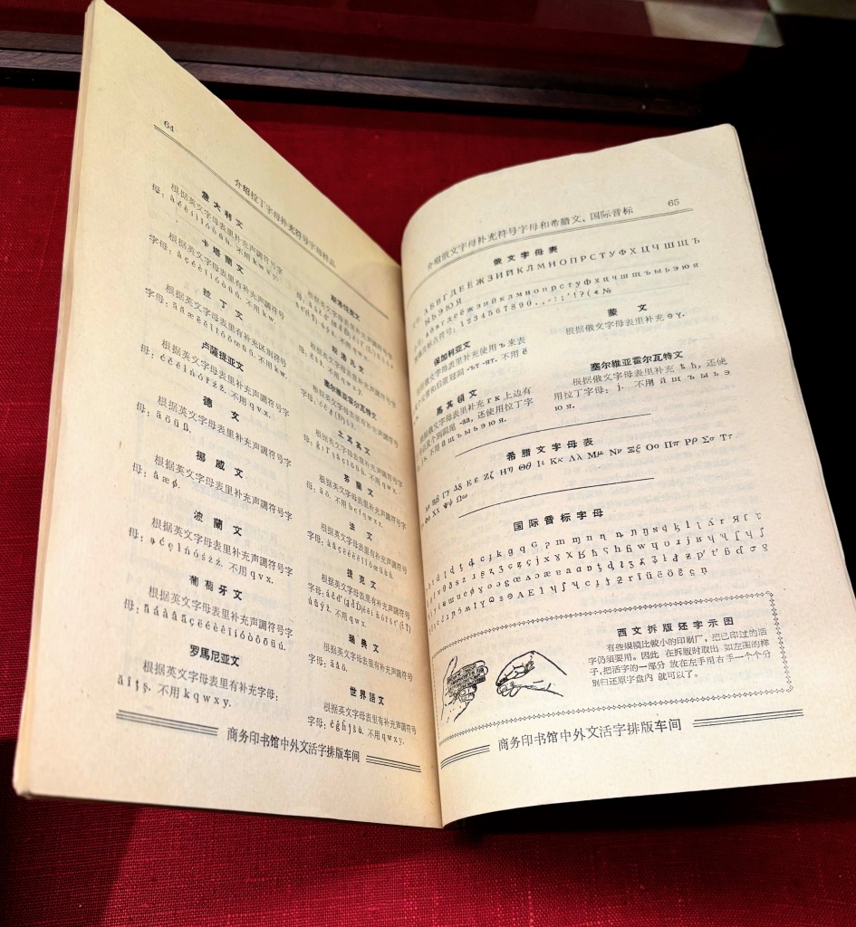
The Commercial Press was the largest publishing company in Republican China, originally founded in 1897 by a group of Chinese students studying western-style printing. This specimen, from the press’ foreign moveable type typesetting workshop, was produced after the recently nationalized enterprise had moved to Beijing. Its most substantial sections focused on Russian and Cyrillic printing and on English-language printing in Latin types. The foreign moveable type division focused largely on dictionaries and polyglot editions aimed at both domestic and international markets, especially within the Communist world. This page opening includes instructions for setting supplemental characters for the Cyrillic alphabets to print in Macedonian, Bulgarian, Mongolian, and Serbian in addition to characters for Greek and international phonetic alphabets.
New Writing Systems
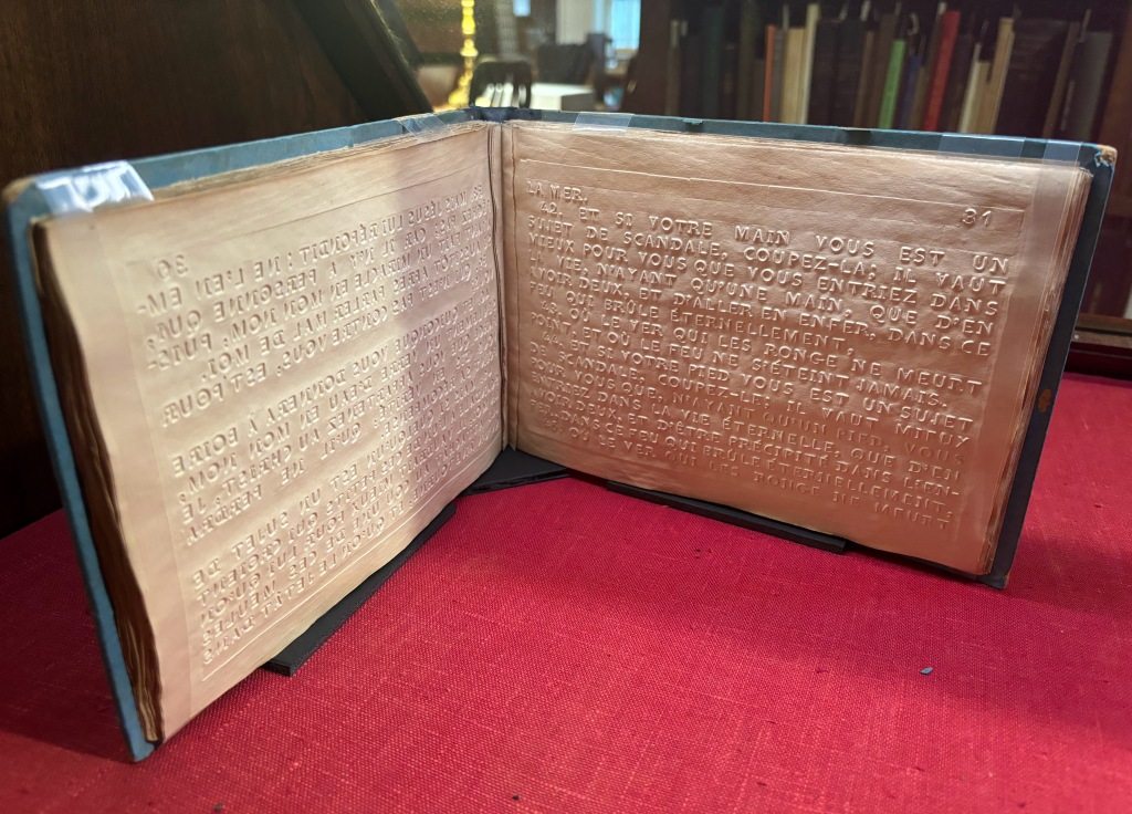
This example shows one of the popular early approaches to printing in relief for the blind, created for use at the Institut royal des Jeunes Aveugles in Paris. The version of relief type used in this book is a modification of John Alston’s 1836 rounded Roman letterforms, simplified and optimized for printing by the director of the Institut, Pierre-Armand Dufau, and executed by Marcellin Legrand, who acted as both printer and typefounder for Dufau’s blind-embossed schoolbooks. The Dufau system debuted in 1840 with a series of schoolbooks of which this copy, which retains its original blind-embossed blue paper and pasteboard binding, was one. Ten years later, Dufau would redirect his institute to focus on teaching and reading in Braille, leading to the demise of the Dufau types in France, though they remained popular in the rest of Europe.
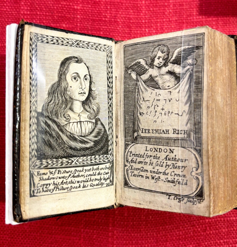
Seventeenth and eighteenth century England saw an explosion of teaching and using shorthand for everything from transcribing plays to writing diaries. The writing master who popularized this particular shorthand system, Jeremiah Rich, issued the two miniature volumes in this case as companion pieces. Like many writing manuals, both volumes were printed entirely from engraved plates and, like typical writing manuals, they were both a teaching tool for Rich’s system and an advertisement for his services. Rich, pictured on the frontispiece of both volumes, was John Locke’s preferred shorthand master, and Locke recommends that students learn Rich’s system in Some Thoughts Concerning Education. Though Rich claims to have been the first to produce a shorthand Psalms, there are several references to a similar works by another writing master, John Willis, in the 1620s.
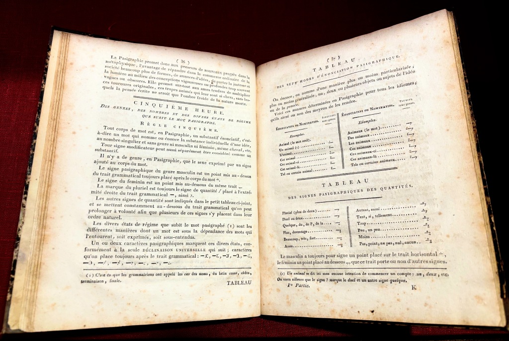
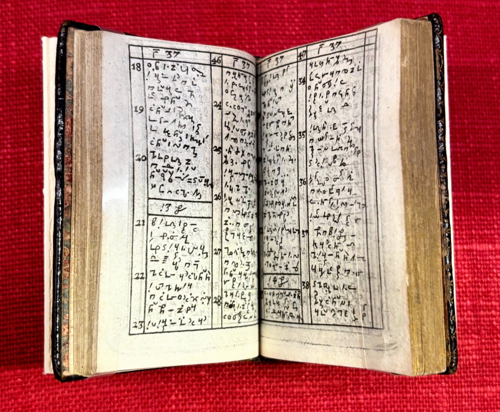
Before Esperanto there was Pasigraphy, the development of artificial languages for the purpose of a universal writing system. Pasigraphies were effectively silent languages, represented by either numeric strings or entirely new characters and intended for written rather than spoken communication. Joseph de Maimieux’s Pasigraphie not only originated the term, a combination of the Greek pasi (all) and grapho (I write), but represents the culmination of nearly 200 years of pasigraphic experiments. His language used twelve new base characters that could be combined into “words” of fixed lengths, along with a series of diacritic symbols to modify them. This book, the first published monograph on Maimeiux’s system, used two different point sizes of pasigraphic types, produced for use at his Bureau de la Pasigraphie in Paris.
